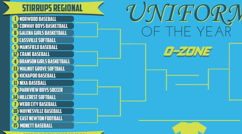
Welcome to the Stirrups Regional of the 2017 Uniform Of The Year Bracket. This round of voting will remain open through midnight Sunday, March 19. Click here for the full bracket and here for the original introductory post explaining the bracket poll.
Each image can be clicked on for closer analysis.
[wpbvideo id=’302983′]
CLICK HERE FOR HIGH TOPS REGIONAL VOTING
CLICK HERE FOR SHORT SHORTS REGIONAL VOTING
CLICK HERE FOR PINSTRIPES REGIONAL VOTING
(1) Norwood Baseball vs. (16) Conway Boys Basketball
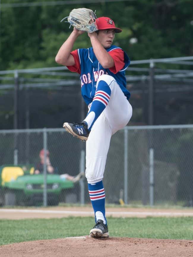
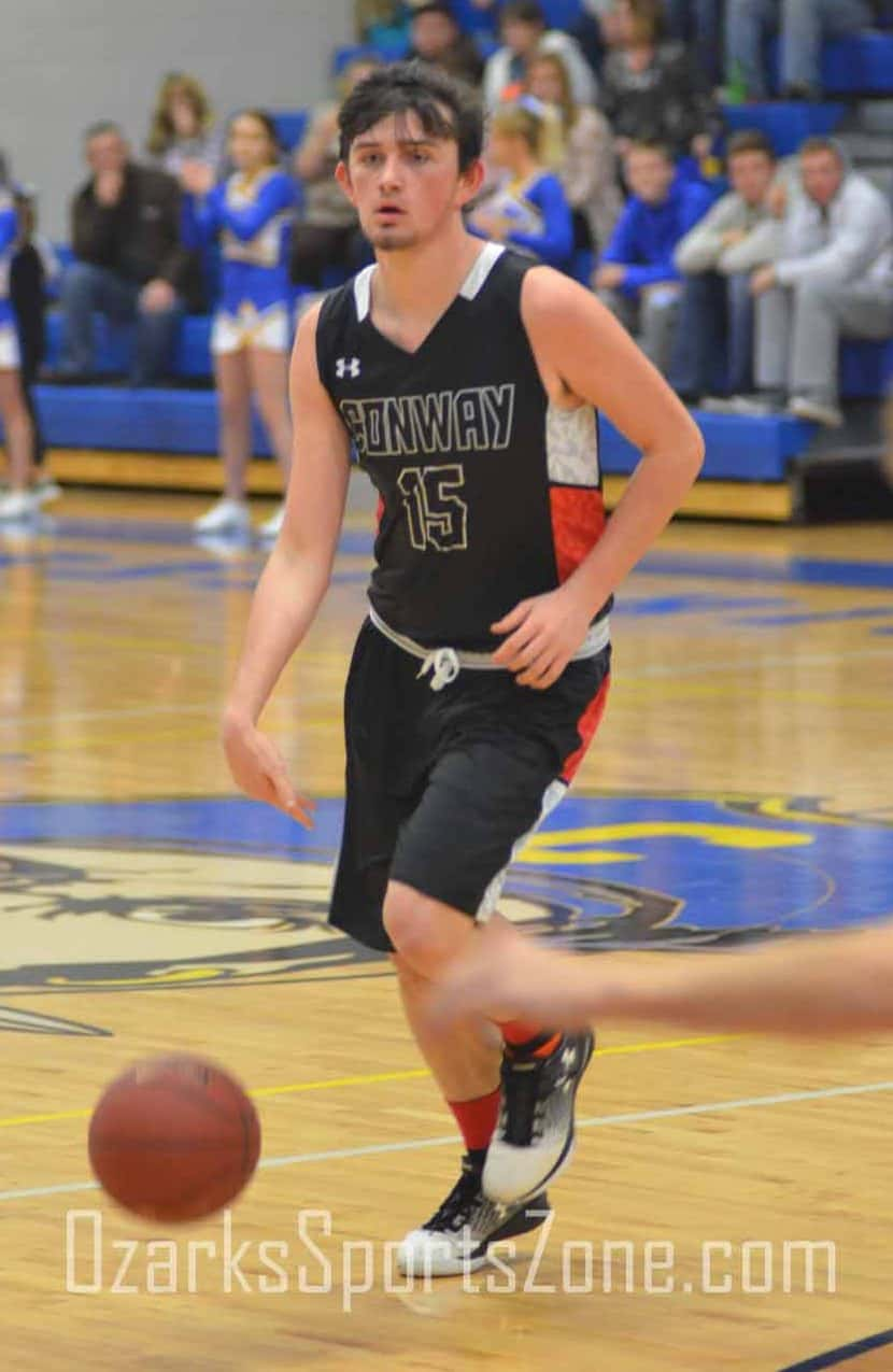
Norwood is a classic through and through. This starts at the stirrups, the royal blue pops against the white pants and the red/white/blue horizontal stripes are fantastic. The “NORWOOD” lettering has a classic feel across the chest and the red hat with an original Pirates logo is a great touch. Add the red sleeves and white uni outline and this was an easy top seed. Conway has a pretty unique design and made the cut for that purpose. The white outline on the chest lettering is a rare site, as are alternating color blocks along the sides.
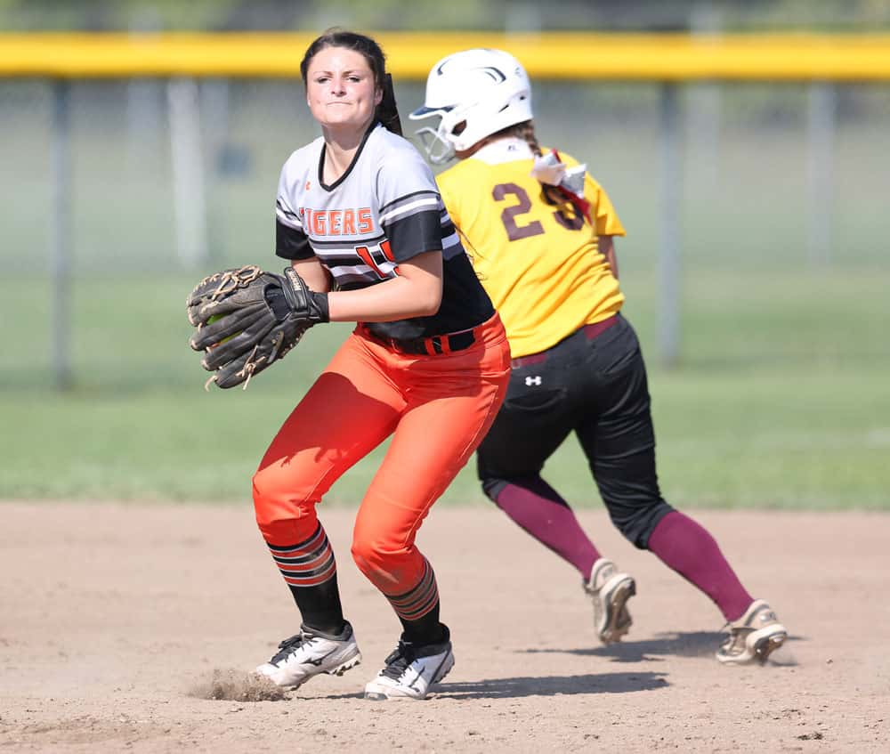
(8) Galena Girls Basketball vs. (9) Cassville Softball
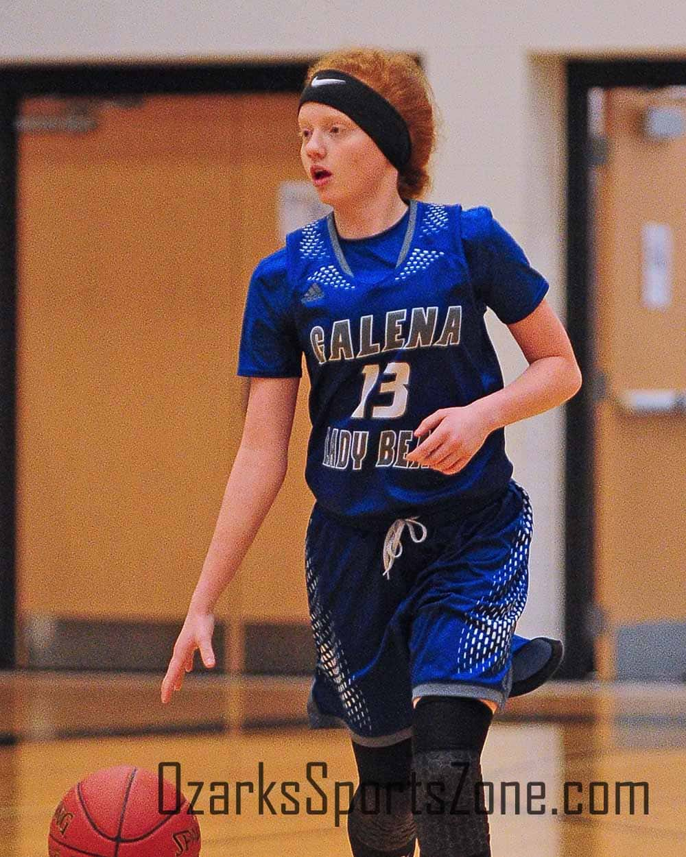
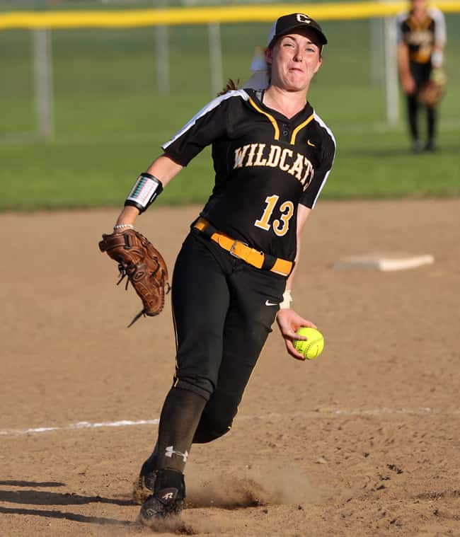
This Galena uni is underrated. Great utilization of the blue/grey color combo with the modern patterns around the collar and on the shorts to bring a little something else to the table outside of the grey lettering. Cassville softball has the advantage of the always nice black/yellow duo, but they don’t get lazy with it. These softball unis have a great sheen in the sun, the yellow belt is a big factor and the name across the chest with the old-school lettering is a smart touch.
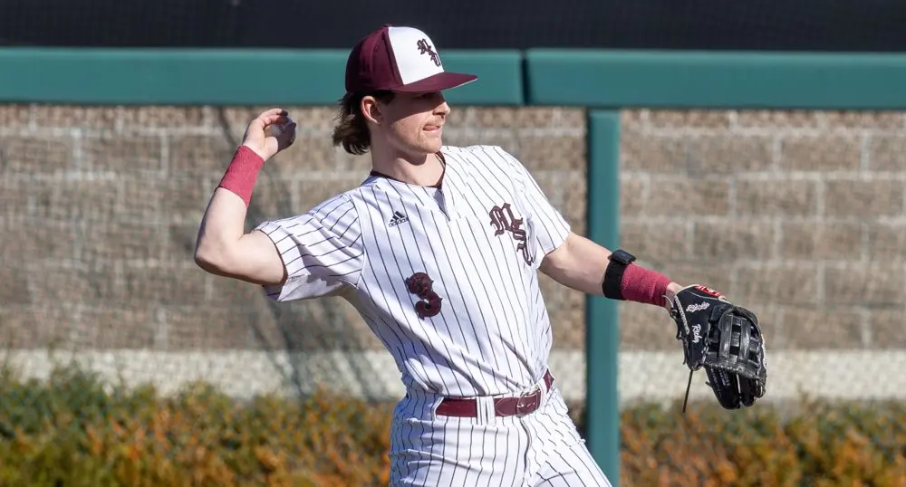
(5) Mansfield Baseball vs. (12) Crane Baseball
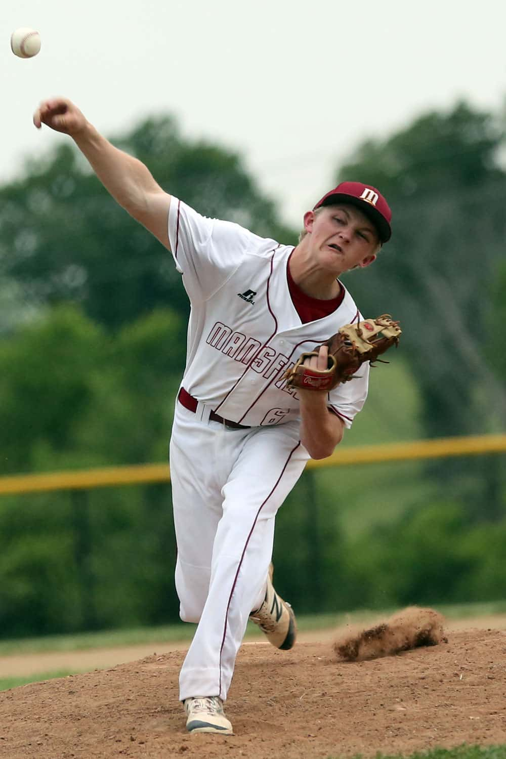
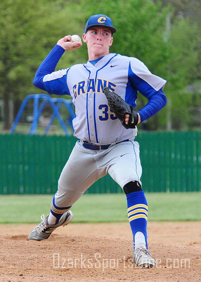
The white Mansfield uniforms are some of the sharpest in this bracket. A single maroon stripes travels the length of the pants and outlines the buttons/collar on the uniform itself. What we liked a lot here was the lettering. The red outline is a very nice touch and underutilized feature. Red hats with these was also smart. Stirrups, stirrups, stirrups for Crane, and these look great and in many ways make this uniform. We liked the road greys and the blue under the sleeves and down the torso.
(4) Branson Girls Basketball vs. (13) Walnut Grove Softball
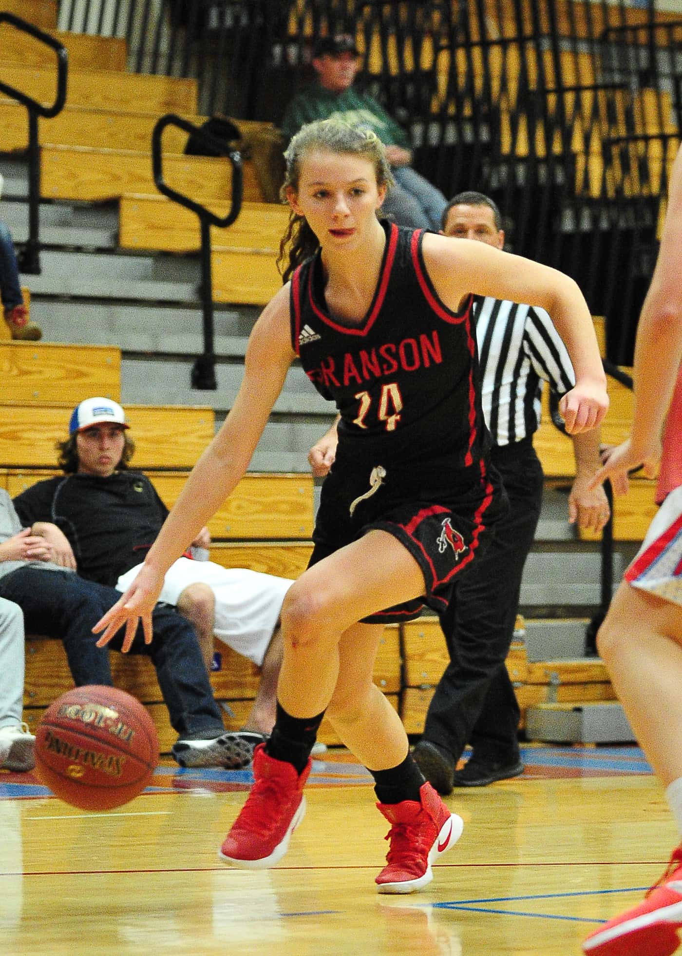
There’s really not another uniform out there like Branson girls basketball. The colors have a lot to do with that, but that doesn’t take away from the thought process behind picking this design. The red outline almost has a neon feel, and the red lettering just looks great in its simplicity, plus, the Pirates flag on the shorts. Also, it makes me think of Stranger Things, so that doesn’t hurt. Walnut Grove softball has that bad 80s baseball look that in 2017 is no longer bad and is now very good.
(6) Kickapoo Baseball vs. (11) Nixa Baseball
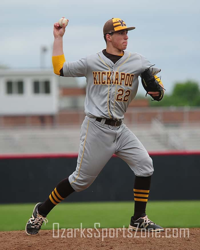
A little baseball vs. baseball matchup here. Kickapoo has some great, clean road greys. What got them in here at a 6-seed though, is the hat. The two horizontal brown stripes make this a distinct uniform, and the yellow horizontal sock stripes certainly don’t hurt either. For Nixa, it’s all in the font. This is a throwback baseball font that’s been used since the 19th century and looks great here. Plus, grey hats are underrated.
(3) Parkview Boys Soccer vs. (14) Hillcrest Softball
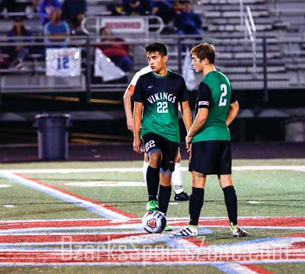
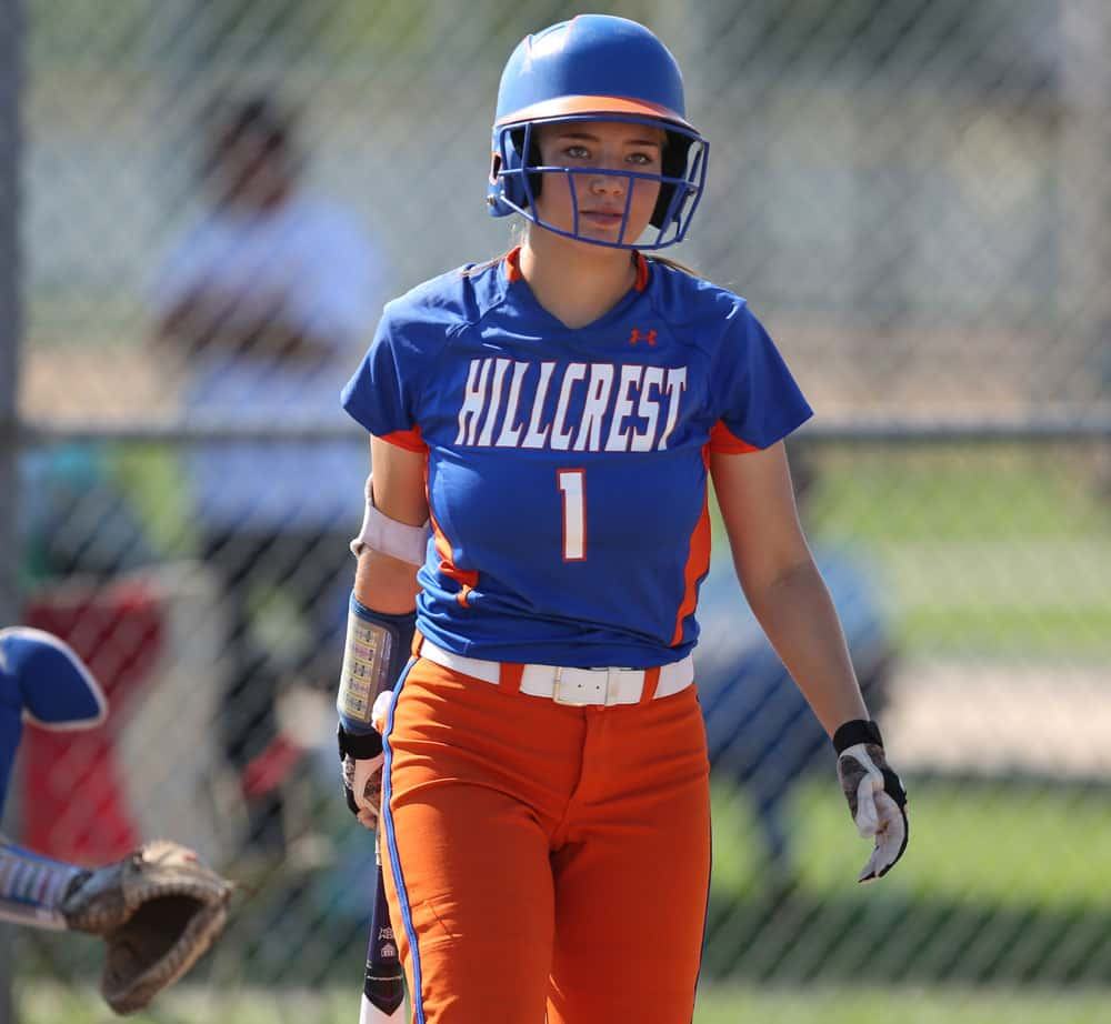
A couple color combos that you don’t see too often in the Ozarks facing off here. Parkview boys soccer looks sharp with the black and green gradient design, and the full green back is a smart choice. We like the big numbers on the shorts as well. Hillcrest has the wildest colors around and do a nice job showing them off with this softball combo. We like the orange under the arms and down the sides of the torse, and the white belt with the orange shorts actually helps the lettering pop more across the chest.
(7) Webb City Baseball vs. (10) Waynesville Baseball
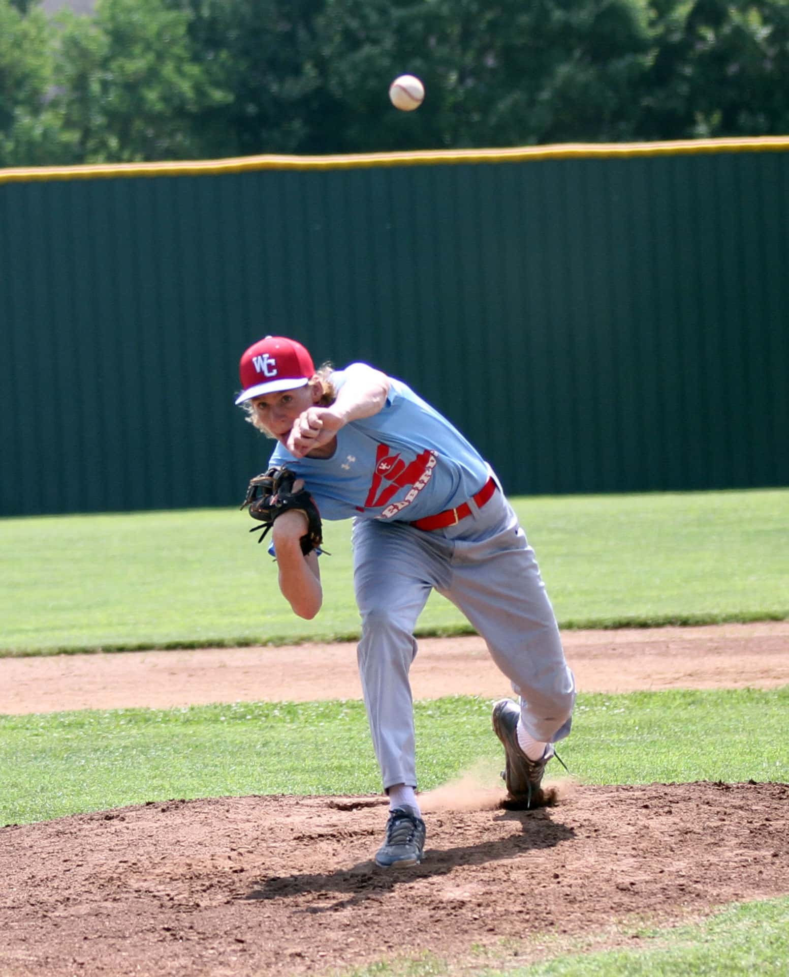

For Webb City, this is very specific to this 1983 Chicago White Sox-style logo used here on the unis. There is not another uniform like this in the Ozarks and our only wish is that we had more photos of it. Waynesville baseball is in here for tradition purposes. Great, modern use of spreading the city/town name across the jersey, and the black sleeves and black front-only cap look great with the high socks.
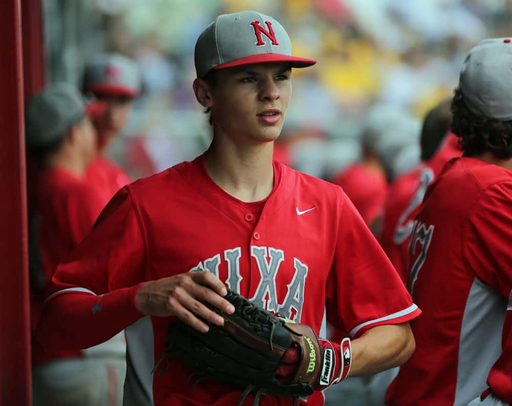
(2) East Newton Football vs. (15) Monett Baseball
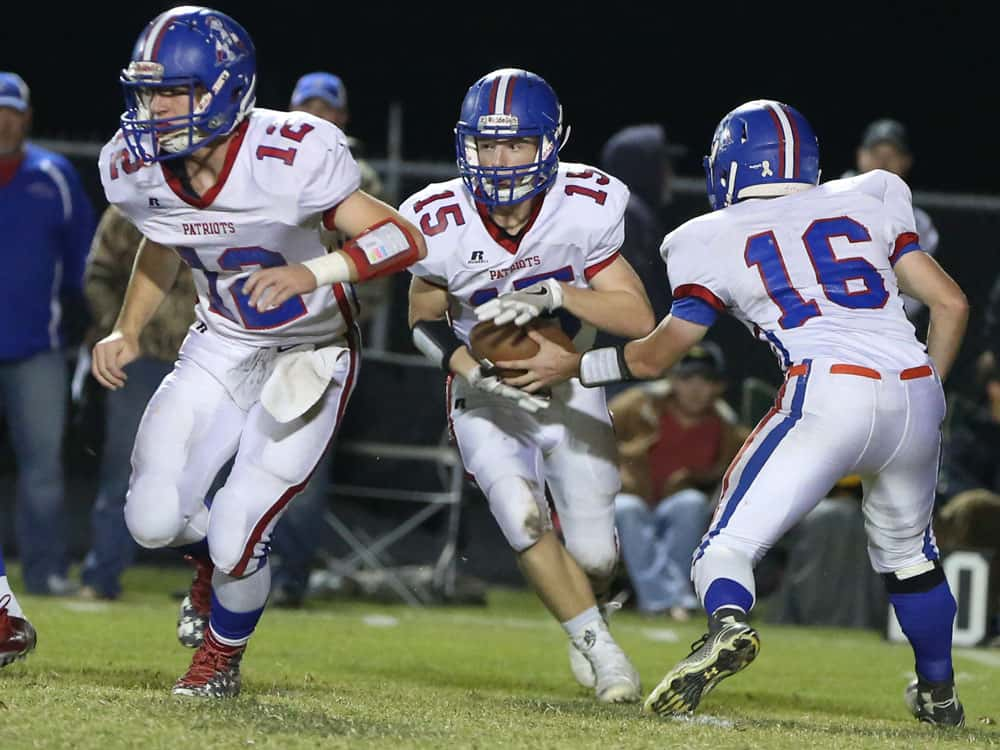
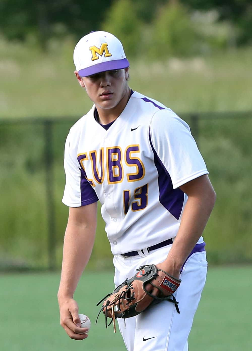
The adoption of the 1980s New England Patriots logo and design puts East Newton into our top tier. The colors do the talking, but East Newton did itself a great service by keeping the design traditional and not forcing things. Classic, clean, timeless. One of four Monett uniforms in the 64-uniform field is Monett baseball. The oversized CUBS lettering looks great and the all-white road uniforms are as clean and pleasing as can be.
CLICK HERE FOR HIGH TOPS REGIONAL VOTING