Welcome to the Sweet 16 of the 2017 Uniform Of The Year Bracket. Voting for all four regionals (Stirrups, High Tops, Short Shorts, Pinstripes) will be done on this page. This round of voting will remain open through midnight Saturday, March 25.
Click here for the full bracket, here for the original introductory post explaining the bracket, here for a recap of the Round of 64 and here for a recap of the Round of 32.
Each image can be clicked on for closer analysis.
Stirrups Regional, Sweet 16
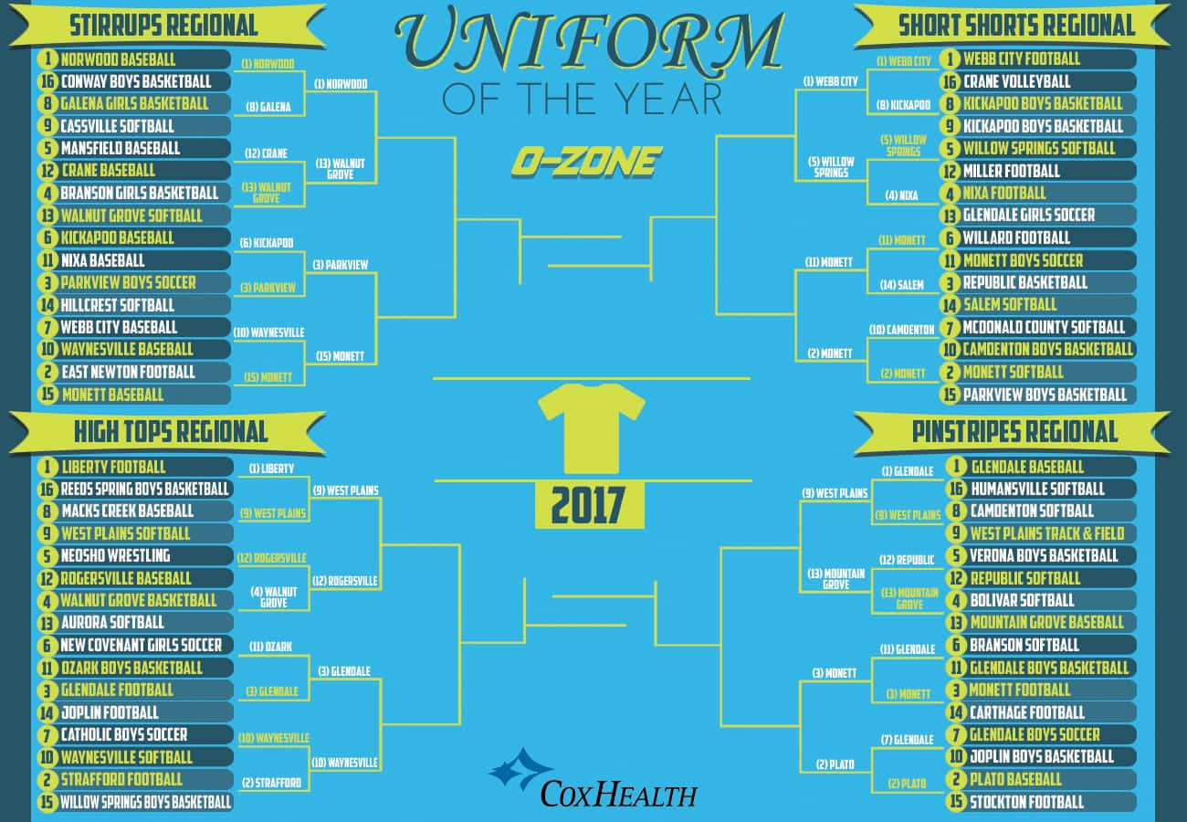
(1) Norwood Baseball vs. (13) Walnut Grove Softball
Norwood is a classic through and through. This starts at the stirrups, the royal blue pops against the white pants and the red/white/blue horizontal stripes are fantastic. The “NORWOOD” lettering has a classic feel across the chest and the red hat with an original Pirates logo is a great touch. Add the red sleeves and white uni outline and this was an easy top seed. Walnut Grove softball has that bad 80s baseball look that in 2017 is no longer bad and is now very good.
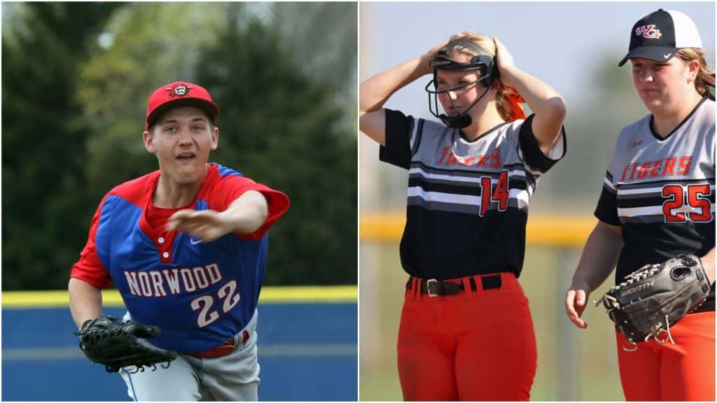
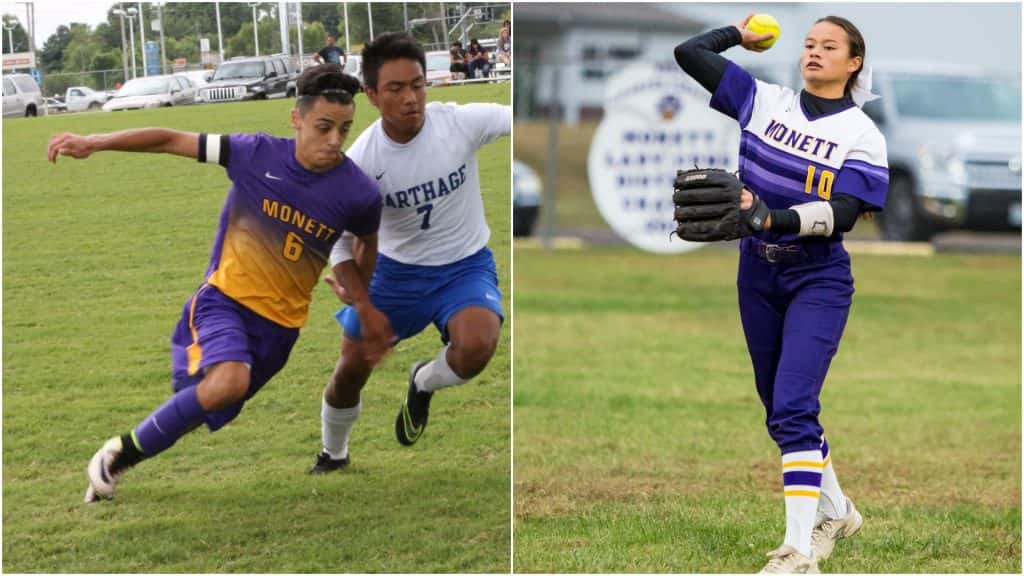
(3) Parkview Boys Soccer vs. (15) Monett Baseball
Parkview boys soccer looks sharp with the black and green gradient design, and the full green back is a smart choice. We like the big numbers on the shorts as well. One of four Monett uniforms still alive is Monett baseball. The oversized CUBS lettering looks great and the all-white road uniforms are as clean and pleasing as can be.
High Tops Regional, Sweet 16
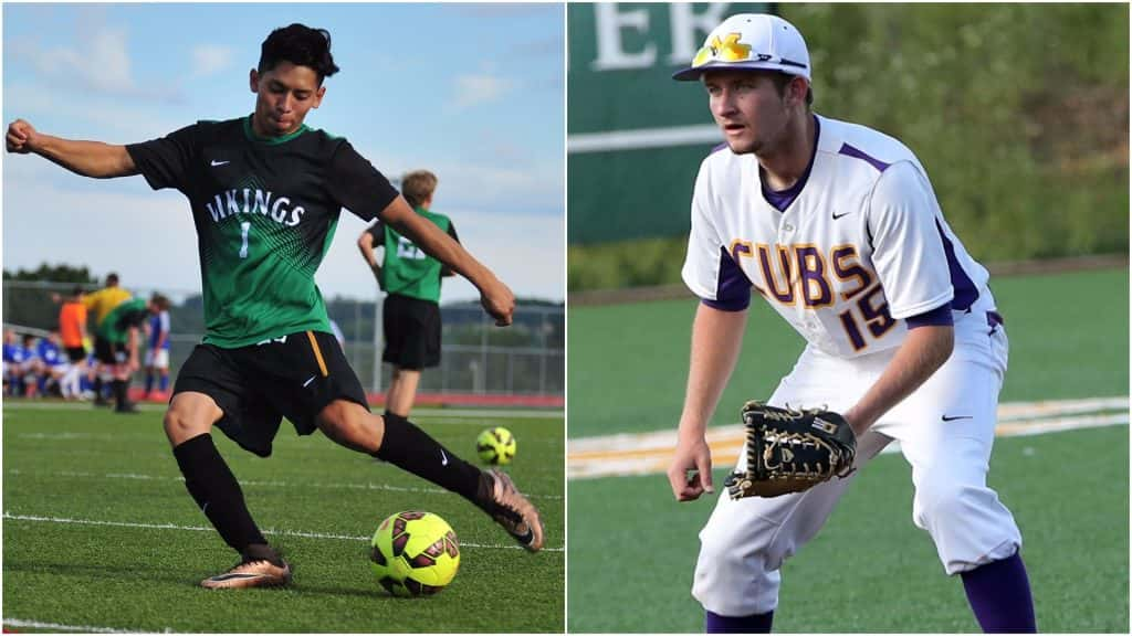
(9) West Plains Softball vs. (12) Rogersville Baseball
West Plains softball did a great job in choosing these. The dark red pants looks great against the black uni and helps bring out the Zizzers “Z” on the sleeve. These Rogersville baseball uniforms are one-of-a-kind. Start with the oversized olde-time “R” in the middle of the chest, then look at the the thick maroon stripe bookended by a pair of grey horizontal stripes (also on the sleeves).
(3) Glendale Football vs. (10) Waynesville Softball
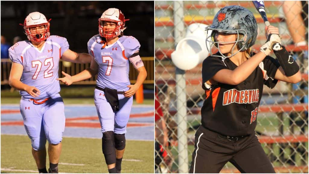
Powder blue tops and bottoms and the white helmet with the red chrome Falcons feathers makes Glendale a top threat in this bracket. Waynesville softball gets a pair of images because they made this list thanks to the backs of these uniforms/helmets. The Tigers logo looks great at the top center and the grey modern-camo helmets are a very cool touch.
Short Shorts Regional, Sweet 16
(1) Webb City Football vs. (5) Willow Springs Softball
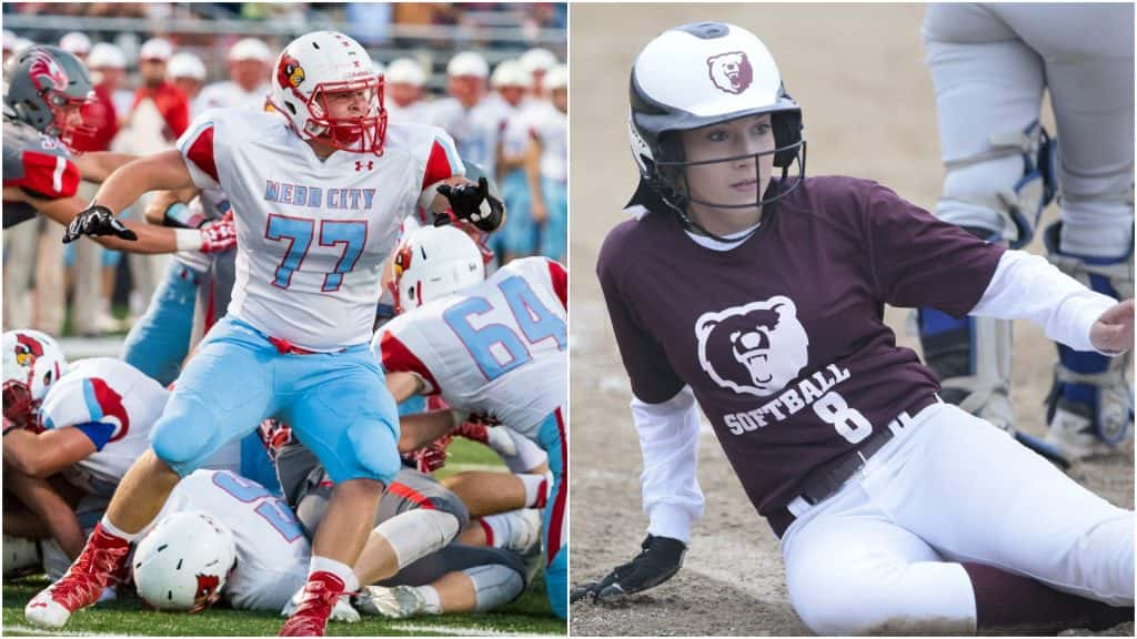
If more people used powder blue, the world would be a better place. Webb City has put a claim on it in the area and it shines best in the white-top football uniforms. They’re clean, classic and unmistakably Webb. Willow Springs softball looks great with these maroon unis and white helmets. The bear mascot takes center stage on both and we loved the choice to go with an oversized logo on the uniform itself. Plus, white pants and a dark-colored high sock pairing is always good.
(11) Monett Boys Soccer vs. (2) Monett Softball
Monett boys soccer is here for its great use of the purple/yellow fading gradient. Just another example of Monett doing uniform design right. Monett took the 1970s/80s-style MLB multi-colored horizontal stripe uniforms and made them AWESOME. The multi-colored purple stripes that make up the gradient separating the full-white top-half of the tops from the full-purple pants and lower torso is beautiful. The “MONETT” block lettering is great. The yellow, left-offset numbers inside the gradient are perfect and the tri-striped white knee socks just add to everything else. This is Monett’s best uniform, and that’s saying a lot.
Pinstripes Regional, Sweet 16
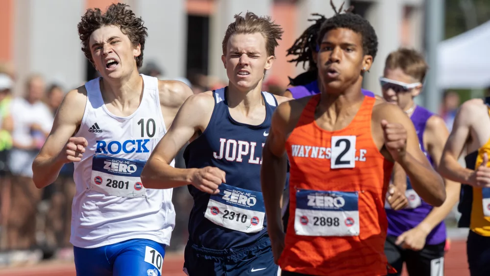
(9) West Plains Track & Field vs. (13) Mountain Grove Baseball
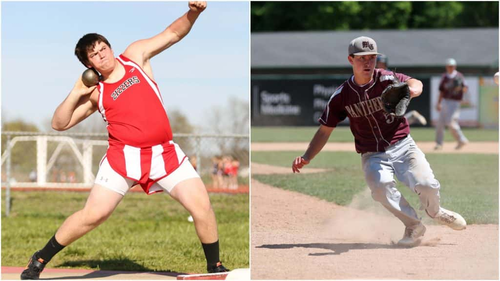
West Plains track and field is on here for those glorious candy-cane striped shorts. No analysis needed. Just enjoy the view. Mountain Grove baseball is here in many ways because of those hats. The olde-time offset “MG” is very cool and unique for the region. The straight block lettering across the uniform is also a bit of a rarity, and it looks good in silver.
(3) Monett Football vs. (2) Plato Baseball
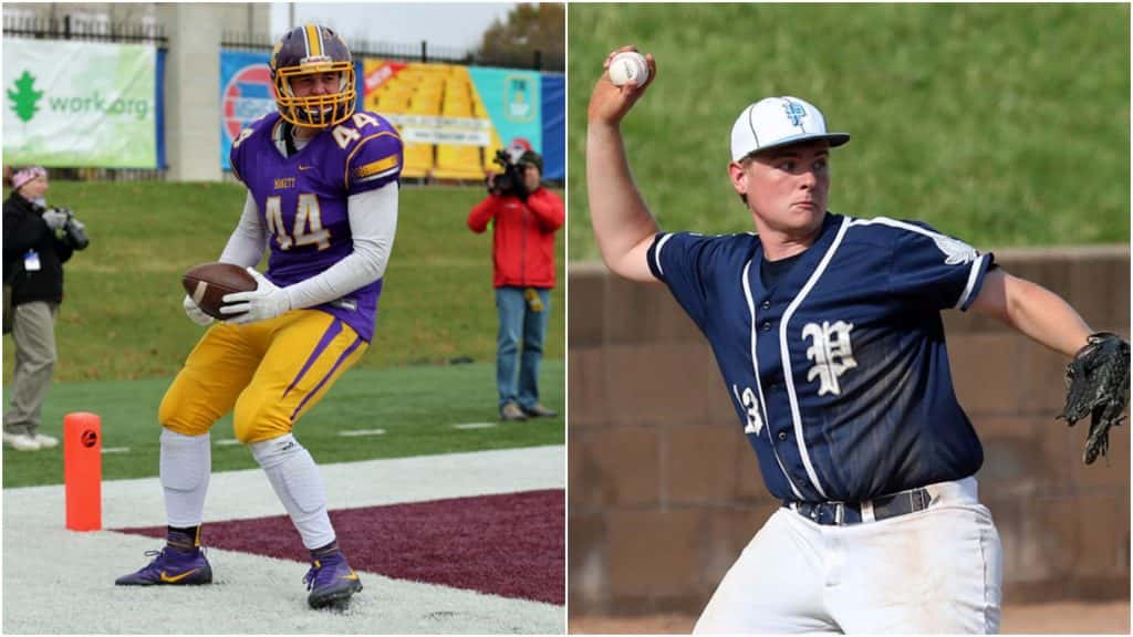
Monett football is a classic football uniform design. The yellow block “M” on the helmet goes well with the thick yellow stripe down the middle flanked by a pair of white stripes. The purple uniform itself wouldn’t be too original but the yellow/white gradient horizontal gradient stripes on the sleeves change that. The two purple stripes on the legs are pretty odd, but that’s what makes them cool and different. One of our favorites is Plato baseball. A great traditional uniform good enough for college ball, Plato’s old-school enlarged “P” above the heart shares the front of this uniform only with the uniform number on the bottom-right (an odd but cool spot for a number). Then there’s the hats. Again, the “P” looks great, but what makes these A+ are the colored seams surrounding the cap. There’s nothing like it around, and that’s a shame because it’s so so good.
Creators: @MattTurer and @JustinLSampson