Welcome to the Stirrups and High Tops Regionals of the 2017 Uniform Of The Year Bracket, Round of 32. This round of voting will remain open through midnight Wednesday, March 22. Click here for the full bracket, here for the original introductory post explaining the bracket poll and here for a recap of the Round of 64.
Each image can be clicked on for closer analysis.
CLICK HERE FOR SHORT SHORTS AND PINSTRIPES REGIONAL ROUND OF 32 VOTING
Stirrups Regional, Round of 32
(1) Norwood Baseball vs. (8) Galena Girls Basketball
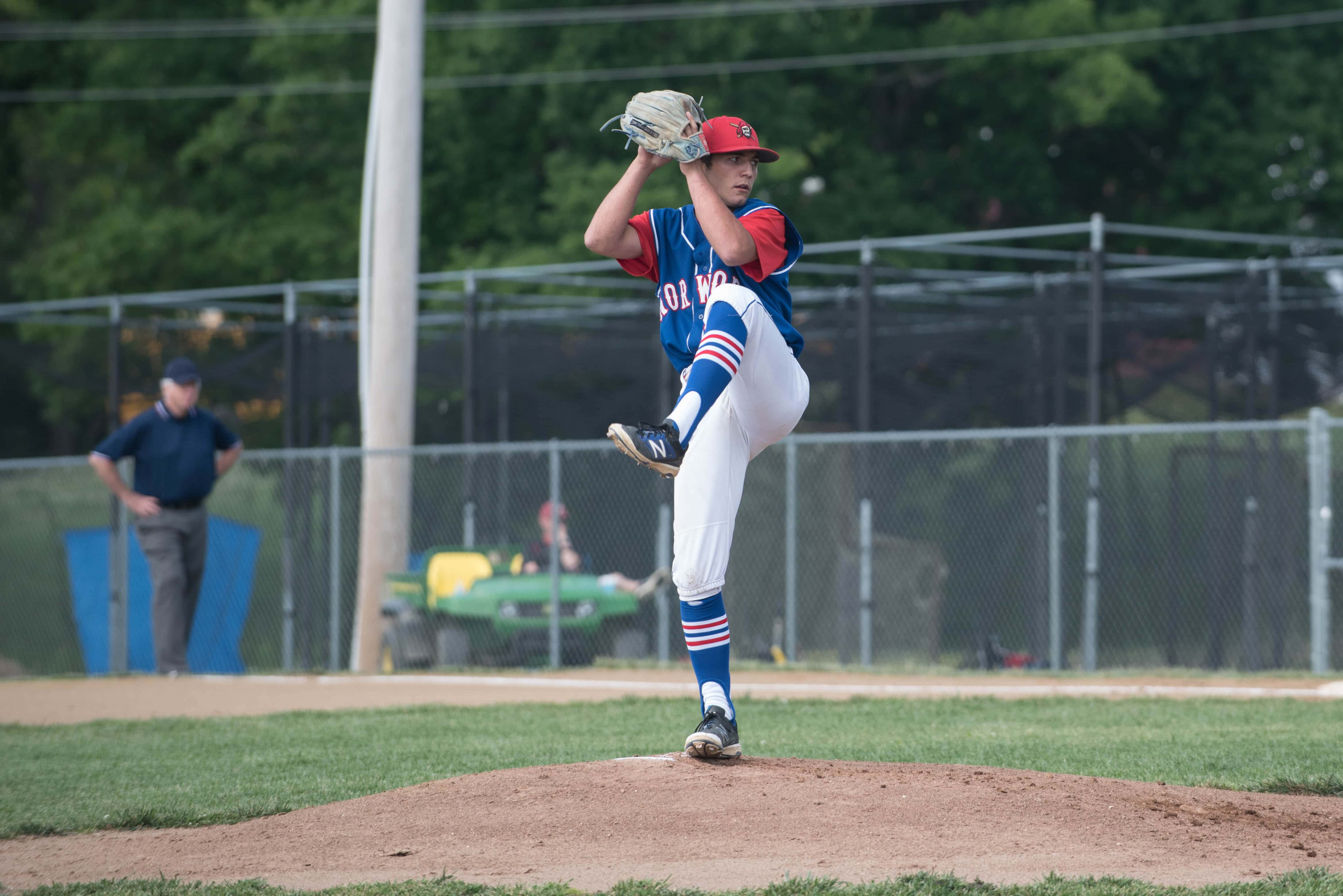

Norwood is a classic through and through. This starts at the stirrups, the royal blue pops against the white pants and the red/white/blue horizontal stripes are fantastic. The “NORWOOD” lettering has a classic feel across the chest and the red hat with an original Pirates logo is a great touch. Add the red sleeves and white uni outline and this was an easy top seed. This Galena uni is underrated. Great utilization of the blue/grey color combo with the modern patterns around the collar and on the shorts to bring a little something else to the table outside of the grey lettering.
(12) Crane Baseball vs. (13) Walnut Grove Softball
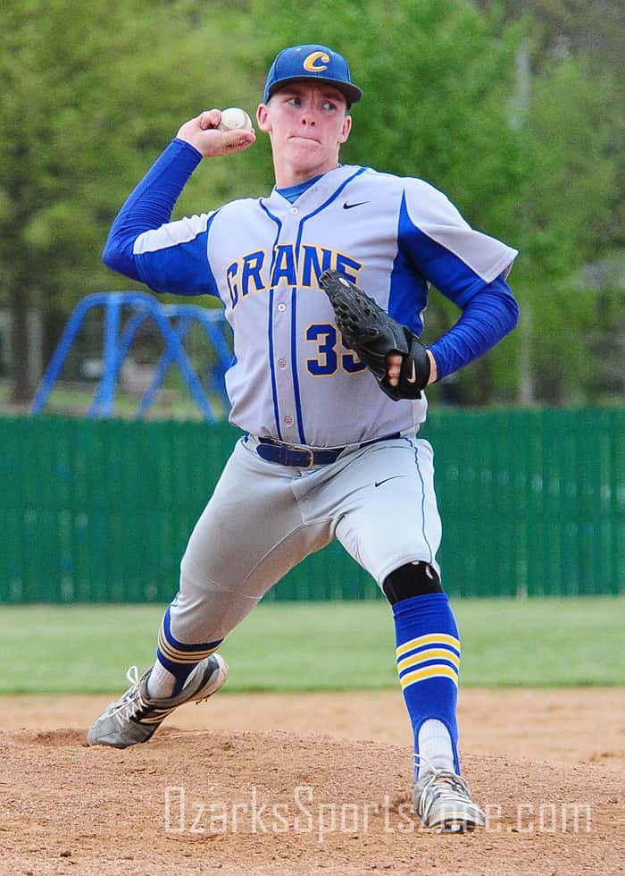
Stirrups, stirrups, stirrups for Crane, and these look great and in many ways make this uniform. We liked the road greys and the blue under the sleeves and down the torso. Walnut Grove softball has that bad 80s baseball look that in 2017 is no longer bad and is now very good.
(6) Kickapoo Baseball vs. (3) Parkview Boys Soccer
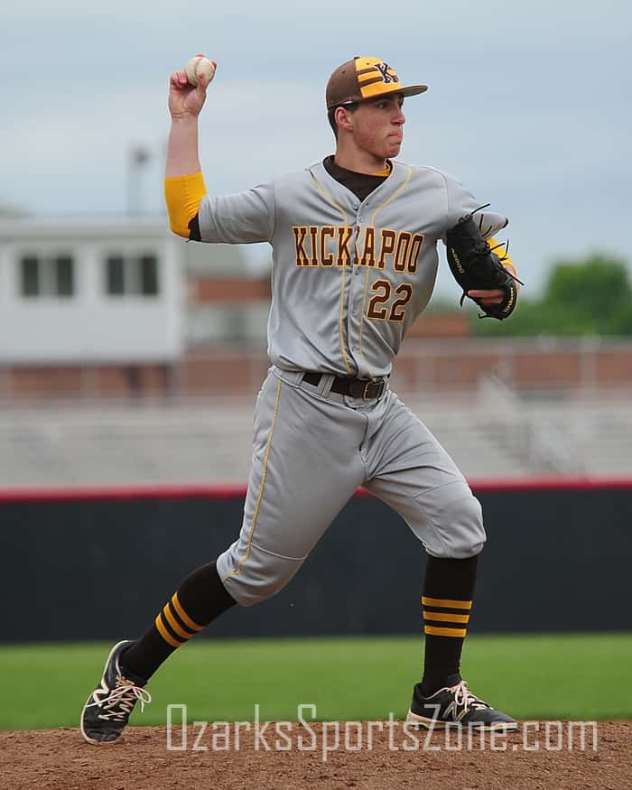
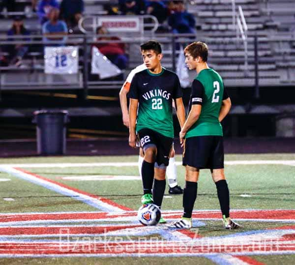
Kickapoo has some great, clean road greys. What got them in here at a 6-seed though, is the hat. The two horizontal brown stripes make this a distinct uniform, and the yellow horizontal sock stripes certainly don’t hurt either. Parkview boys soccer looks sharp with the black and green gradient design, and the full green back is a smart choice. We like the big numbers on the shorts as well.
(10) Waynesville Baseball vs. (15) Monett Baseball
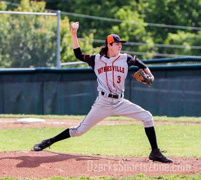
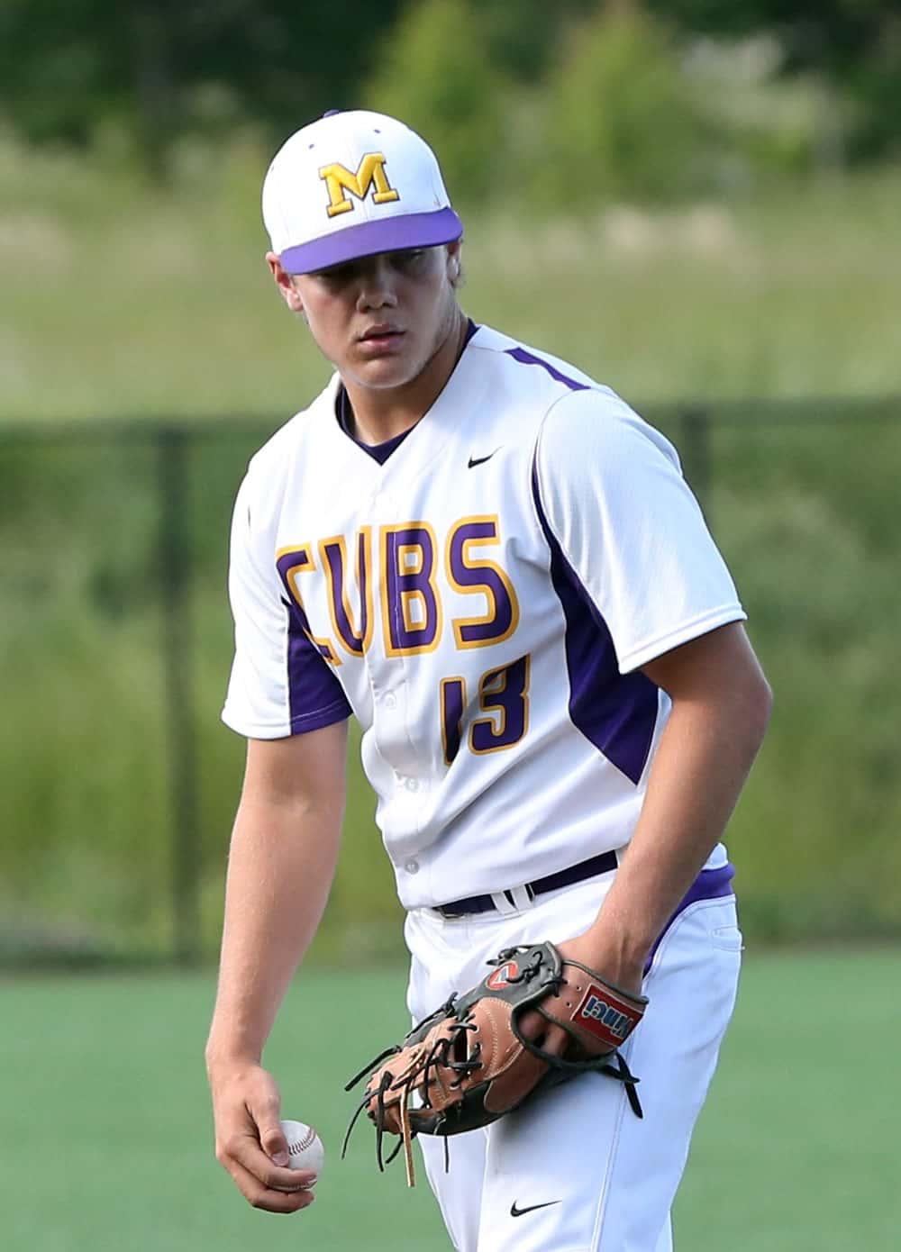
Waynesville baseball is in here for traditional design purposes. Great, modern use of spreading the city/town name across the jersey, and the black sleeves and black front-only cap look great with the high socks. ne of four Monett uniforms in the 64-uniform field is Monett baseball. The oversized CUBS lettering looks great and the all-white road uniforms are as clean and pleasing as can be.
High Tops Regional, Round of 32
(1) Liberty Football vs. (9) West Plains Softball
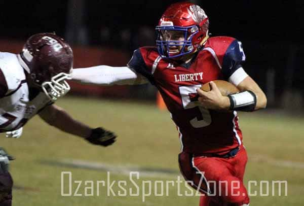
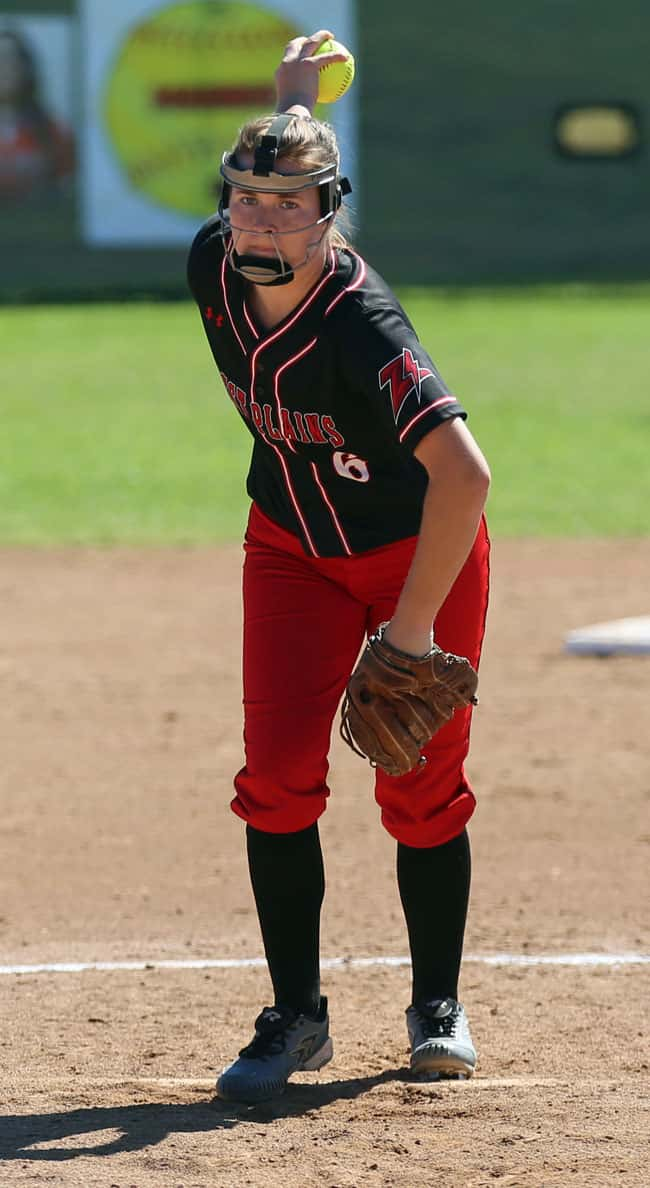
The brick red, the navy blue, the silver chrome eagle feathers on the helmet. All reasons for Liberty getting a top seed. This is a rich uniform that always stands out under Friday night’s lights. West Plains softball did a great job in choosing these. The dark red pants looks great against the black uni and helps bring out the Zizzers “Z” on the sleeve.
(12) Rogersville Baseball vs. (4) Walnut Grove Basketball
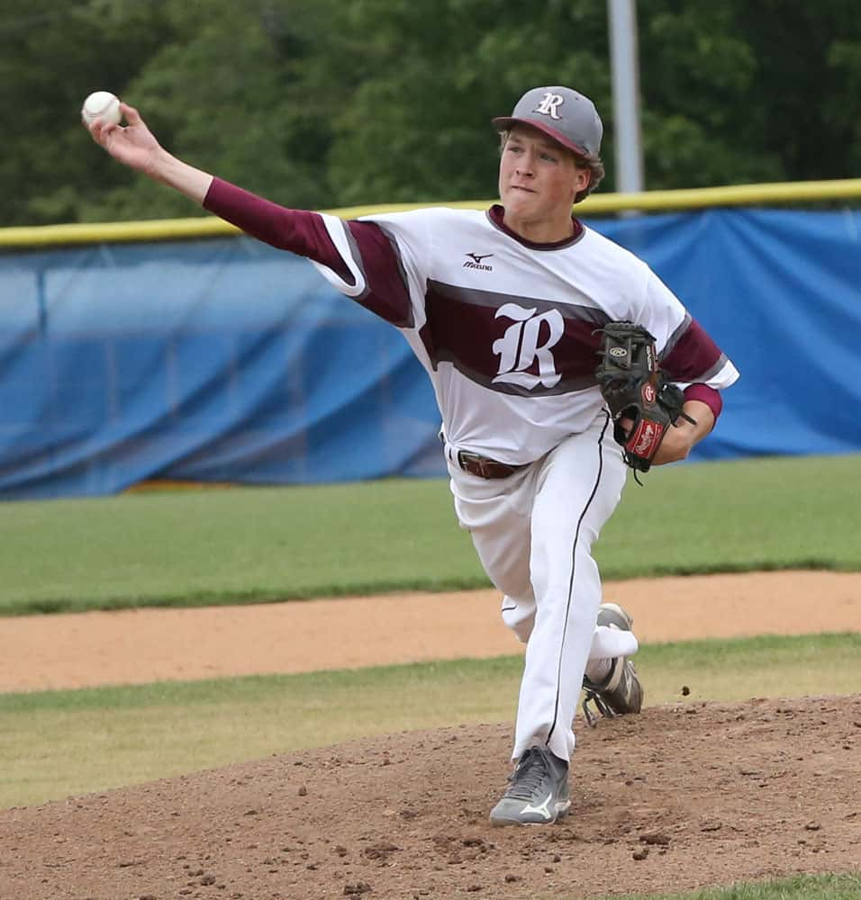
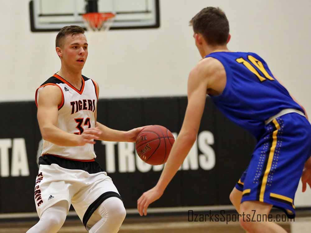
These Rogersville baseball uniforms are one-of-a-kind. Start with the oversized olde-time “R” in the middle of the chest, then look at the the thick maroon stripe bookended by a pair of grey horizontal stripes (also on the sleeves). “THE GROVE” lettering on the shorts gets Walnut Grove (boys and girls) a high seed. A very cool feature that looks great on both the road whites and home blacks for The Grove.
(11) Ozark Boys Basketball vs. (3) Glendale Football
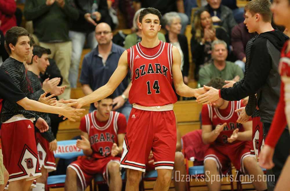
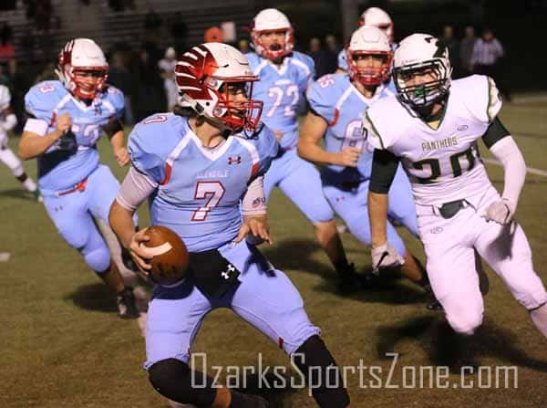
The Ozark “Bulls” jerseys are in for that exact purpose. Whether or not on purpose (probably on purpose?), this is a great reproduction of a classic NBA uniform. Powder blue tops and bottoms and the white helmet with the red chrome Falcons feathers makes Glendale a top threat in this bracket.
(10) Waynesville Softball vs. (2) Strafford Football
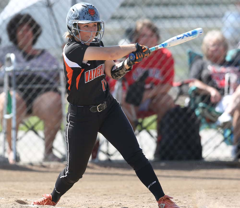
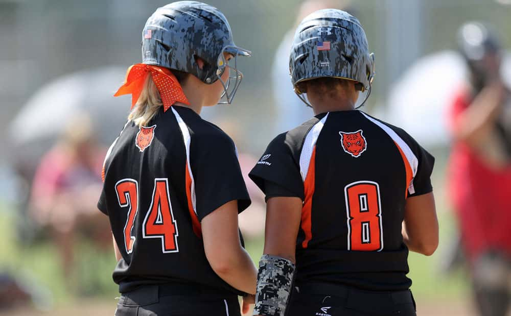
Waynesville softball gets a pair of images because they made this list thanks to the backs of these uniforms/helmets. The Tigers logo looks great at the top center and the grey modern-camo helmets are a very cool touch. What we’re seeing here is Strafford taking the Florida State helmet and making it BETTER. The garnet spearheads on the white helmet are things of beauty. The black tops and black bottoms are becoming more common, but are still incredibly sharp. What gets things done here outside the helmet is the lined black/white gradient inside the numbers. Great work.
CLICK HERE FOR SHORT SHORTS AND PINSTRIPES REGIONAL ROUND OF 32 VOTING
Creators: @MattTurer and @JustinLSampson
